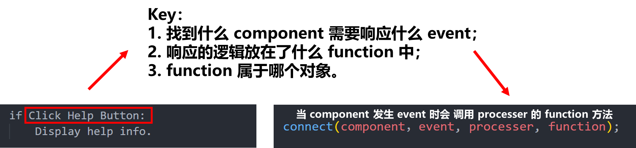
QT:QML基础
QT 的所有可视控件都继承自 Item 因此也就具有了它的所有属性。
常用属性
基本属性
控制位置:
x相对于父元素左侧的偏移y相对于父元素右侧的偏移z可以理解为当前元素的层级
控制大小:
width控制窗口大小,宽度height控制窗口大小,高度
锚点 anchors
anchors.fill: 当前控件填充到哪个控件anchors.left:当前控件左边和谁挨着anchors.leftMargin:当前控件左边的 marginanchors.center:当前控件在谁的中间
锚点还有许多属性,可以查阅文档。简单说锚点就是描述的当前控件的相对的一些属性(这里和绝对区分开来)
Rectangle{
    id: rec1
    width: 100
    height: 100
    color: "red"
}

Rectangle{
    id: rec2
    width: 100
    height: 100
    color: "green"
    anchors.left : rec1.right
}
上述代码实现 rec2 的左侧与 rec1 的右侧相邻。

焦点 focus
焦点的概念十分重要,获取到焦点的控件才能够接收到信息或者是键盘的响应。
通常可以通过 focus: true 来设置控件获取焦点,但是同一时间只能有一个控件获取到焦点。
设置动画(Animation and transition)
Animation
每次只能设置一个属性,规定这种属性的变化,并设置动画时间。
一般来说 PropertyAnimation 可以修改所有属性,其他的如 NumberAnimation 则更加具体的描述修改哪一类的属性。
Animation 动画有两种调用方法:
第一种:
通过 id.start() 开启动画
PropertyAnimation{
    id: animateColor;
    target: rec;
    properties:"color";
    to:"green";
    duration: 1000
}
NumberAnimation{
    id: animateOpacity
    target: rec
    properties: "opacity"
    from: 0.1
    to: 1.0
    duration: 2000
}

Rectangle{
    id: rec
    width: 100
    height: 100
    color: "red"
    Button{
        width: 50
        height: 20
        text: qrTr("btn")
        onClicked:{
            animateColor.start();
            animateOpacity.start();
        }
    }
}
第二种:
通过在 PropertyAnimation 后面添加 on 某个属性,就可以快速设置动画,动画立即生效
Rectangle{
    id: rec
    width: 100
    height: 100
    color: "red"
    PropertyAnimation on color{
        to: "green"
        duration: 1000
    }
}
按顺序执行:
使用 SequentialAnimation{} 并在其中声明其他的 Animation
SequentialAnimation{
    id: sqAnimation
    PropertyAnimation{
        id: animateColor;
        target: rec;
        properties:"color";
        to:"green";
        duration: 1000
    }
    NumberAnimation{
        id: animateOpacity
        target: rec
        properties: "opacity"
        from: 0.1
        to: 1.0
        duration: 2000
    }
}

Rectangle{
    id: rec
    width: 100
    height: 100
    color: "red"
    Button{
        width: 50
        height: 20
        text: qsTr("btn")
        onClicked:{
            sqAnimation.start()
        }
    }
}
transitions (多个动画)
结合 state 使用,可以添加动画效果。
from 和 to 实际上是状态的切换,他们的值都是字符串(状态)。
transitions: {
    Transition {
        from:"PRESSED"
        to:"RELEASED"
        ColorAnimation {target: button; duration: 10001}
    },
    Transition {
        from:"RELEASED"
        to:"PRESSED"
        ColorAnimation {target: button; duration: 1000}
    }
}
Behavior
QML 中有设置动画的属性:Behavior ,例如:
- 设置鼠标事件
- 设置 Behavior
- 触发鼠标事件
Behavior 是对某一个属性进行的相应,某个属性改变后就进行动画效果。
其作用有点类似 css 的 transition
其他
QML 中的很多属性十分类似 css
rotation,旋转scale,缩放- border:边框
border.widthborder.color
radius,圆角- gradient,渐变相关
Image可以加载图片并且设置大小AnimatedImage加载动图
组件 Component 和 Loader
Component 中的函数
Component.onCompleted:类似生命周期中的 onReady ,组件创建的时候触发Component.onDestruction:在组件销毁的时候触发(析构时)
动态和异步的加载资源
创建 Component 控件后,其内部元素不会立刻加载,而是需要设置一下条件,这时需要用的 Loader
Component{
    id: com
    Rectangle{
        width: 100
        height: 100
        color: "red"
    }
}
Loader 中加载资源(创建)可以使用两个熟悉属性:
source:值为一个 URL,可以加载 QML 文件sourceComponet:值为自己创建的Component的id
结合上面的“构造”和“析构”,这两个函数是在创建和销毁的时候调用,当我们人为修改 source 或者 sourceComponent 时则是创建和销毁的过程。
loader.item:表示 Loader 加载的组件,通过这个属性可以对其加载的组件进行设置(如宽高、位置等等)
事件
点击事件
这里介绍两种触发点击事件的控件:
MouseArea
触发一些鼠标事件:
onClicked鼠标点击,已经松开onPressed按下鼠标onReleased松开鼠标(先于 click)
**drag**相关属性:可以拖动控件
onPressAndHold:长按控件
Button
- check 状态
checkable设置选中状态
autoExclusive排他性,同一时间只能有一个按钮别选中autoRepeat:不断触发三个信号autoRepeatDelay:设置第一次间隔autoRepeatInterval:设置每次的间隔(类似定时器)icon设置图标indicatortext设置按钮的文本background:设置背景,值为Item
Button{
    id: btn
    background: Rectangle{
        anchors.fill: btn
        color: "red"
    }
}
键盘事件
Keys.onRightPress:{

}
分为专用和通用两种,通用的事件响应后可以再判断从而做出进一步处理。
自定义组件
基础功能
自定义的组件应该被创建为一个新的 QML 文件,非常类似 c++ 中创建了一个新的类。
在 QML 中我们可以通过 property 声明一些变量,变量的类型除了基本数据类型以外还可以是一些组件,例如 Component 等等。
property 声明的变量可以在外部调用自定义组件时进行赋值,从而实现一些自定义的行为。
property Component 以及 Loader 的结合
我们可以在外部自定义 component 然后传递给自定义组件,然后在自定义组件中使用 Loader ,控制加载的样式。这样做可以动态加载组件。
var 类似 auto ,可以自动推断
如何只读属性?
添加 readonly 属性
外部必须提供的属性:
required
别名
使用 property alias 表示别名,例如:
property alias anotherTime: thisLabel.times
从而可以从外部获取到内部的组件或者是某个属性,最小开放原则
弹窗 Popup
Popup {
    id: popup
    x: 100
    y: 100
    width: 200
    height: 300
}
默认的 visible 是 false。
不加修饰的 popup 是类似 rectangle 的,功能需要自己实现。
打开关闭
- 自己设置 visible 属性
- 调用函数
id.open()id.close()
两个例外:
通常父控件 visible false 则子控件不显示,但是 popup 不受这个控制。
popup 不受 z 属性的控制,会始终在最上层。
因为 popup 是一个弹窗,他的 z 只会在 popup 之间生效
默认的关闭策略
clossPolicy 默认则:点击popup外部会默认关闭(或者esc)
但也可设置一些属性进行限制(查阅文档)
模态对话框
modal: true
不可以操作其他控件
modal: false
可以点击其它控件
dim :控制除 popup 以外的背景色
- 非模态下的鳖精颜色是否设置
进入和退出的动画
实现渐变或者是其他功能
enter: Transition {
    NumberAnimation{
        property:"opacity";
        from: 0.0;
        to: 1.0;
        duration: 1000;
    }
}
exit:Transition{

}
绘制内容
- background
- contentItem
添加控件
其他的:
overlay
Repeat 重复绘制
Repeater {
//模型 数字的话 表示有几个模型/控件
model: 3
Rectangle {
    y: index * 50
    width: 100;
    height: 40
    border.width: 1
    color: "yellow"
}
model 的值也可以是 list (数组)(list 长度就是要创建几个控件)
在子控件中使用 modelData 可以获取到当前控件对应的 list 中的 值
可以用 row 和 column 控制
信号与槽
Connections {
    target: window
    function onTestSig(str,iValue){
        console.log(str,iValue)
    }
}